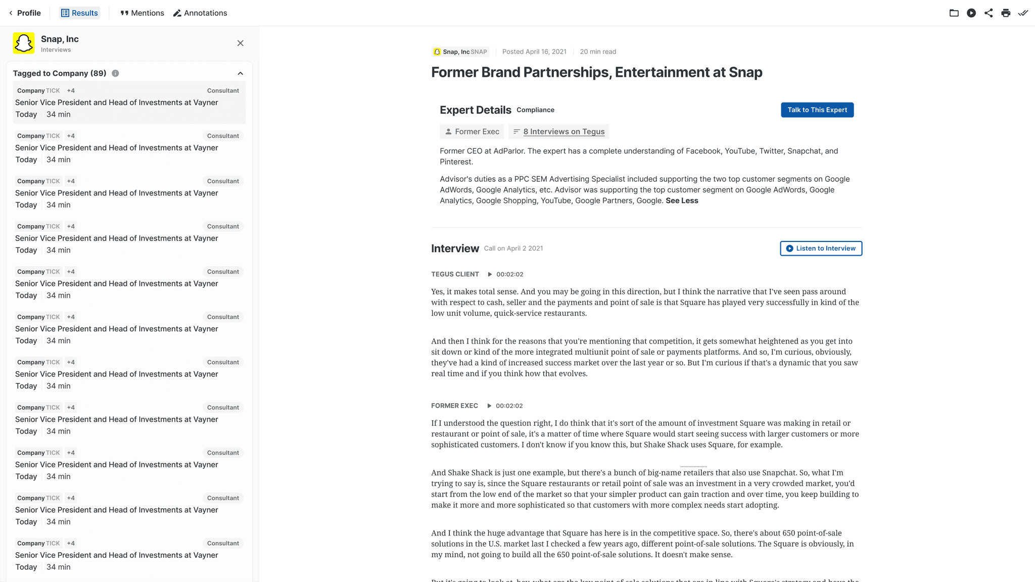
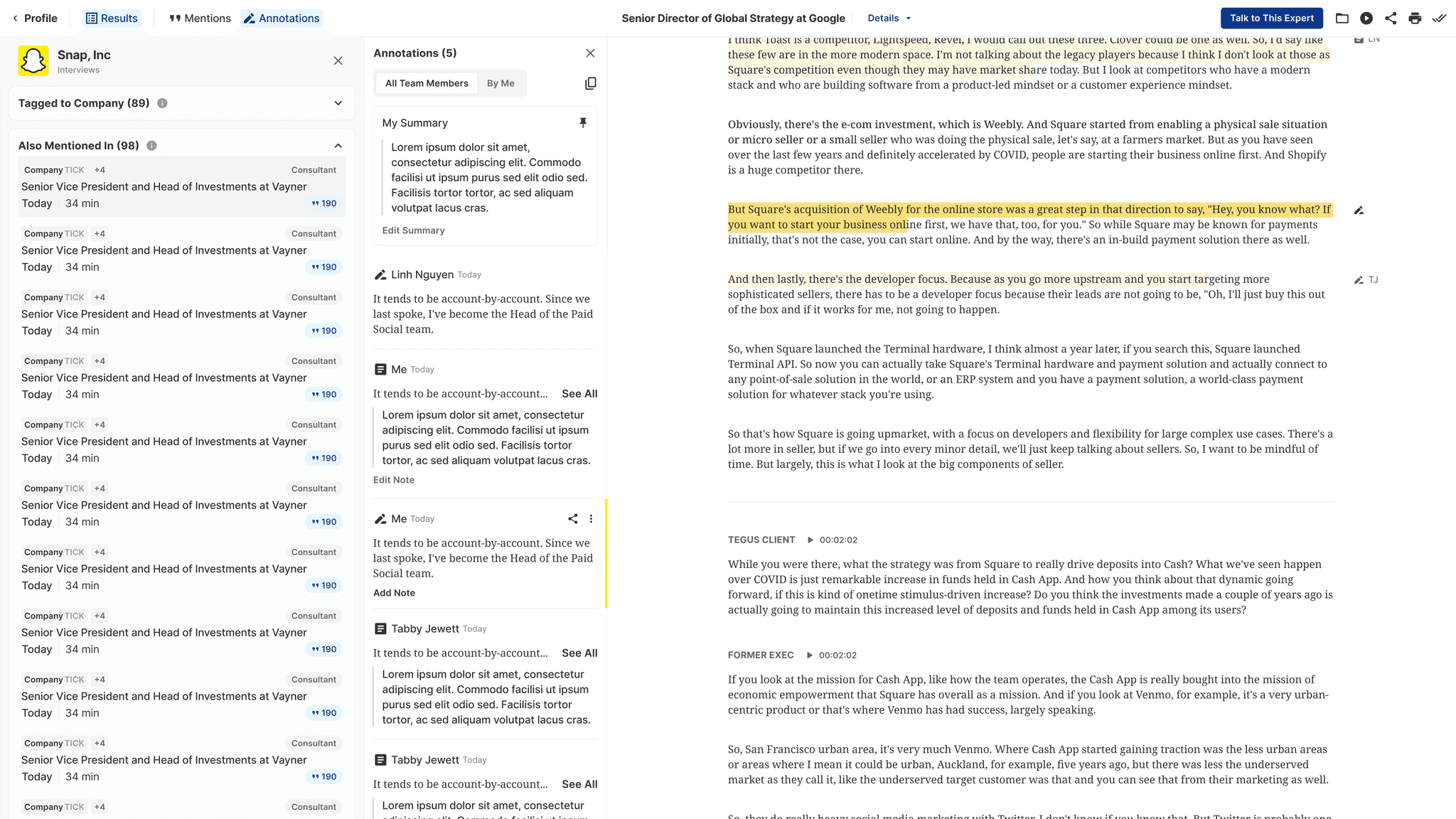
Background & Problem
Tegus, a research platform for investors, houses dense qualitative content – given these are investment decisions, companies are the core search focus (60% of searches).
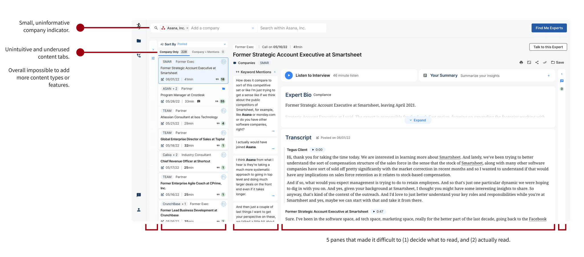
However, the single company experience tried to be everything: search results, keyword search, collaboration, and reading room. As features grew, it became bloated and hard to navigate for users and difficult to scale for new data that the business needed online ASAP.
Through the Product Vision I conducted earlier, we decided to split Document View and Company Search Experience into dedicated pages for a more focused and scalable solution.
Approach
Phase 1: Meeting Immediate Needs and Learning
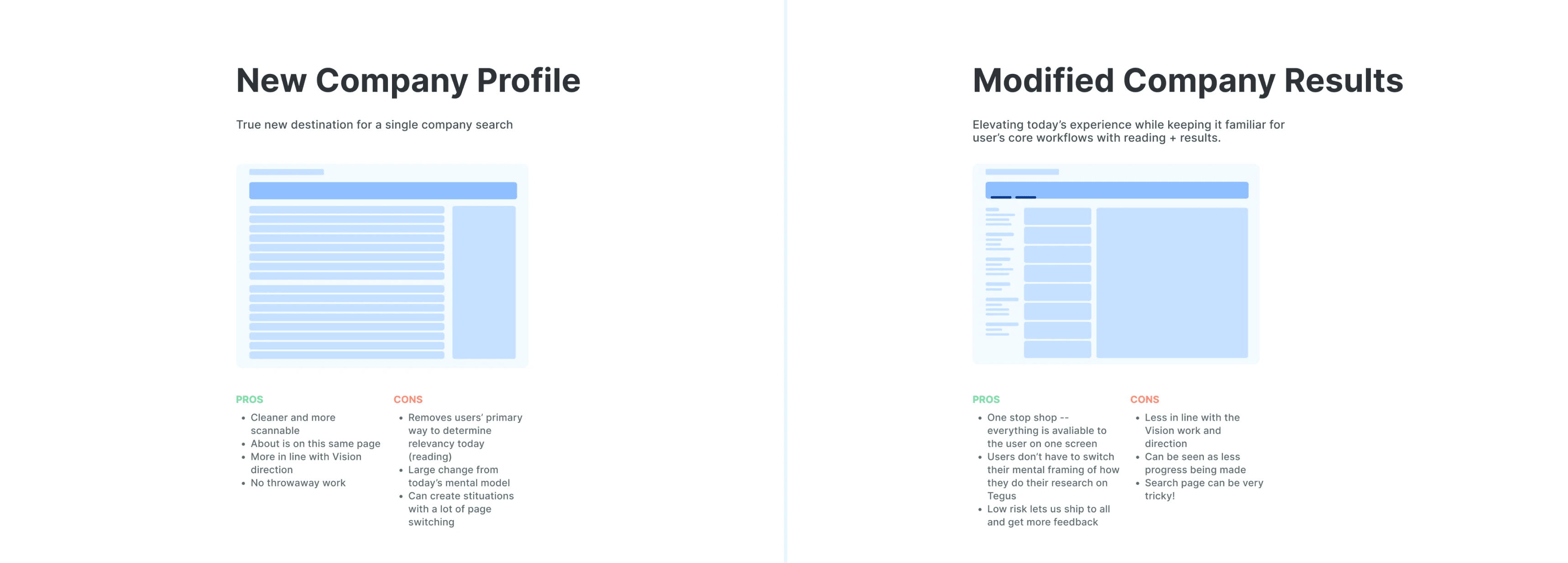
The original scope defined was to immediately transition to a new layout, most notably removing the reading experience from the page. My concern was the impact to our user’s workflows – without a risk mitigation plan, we could lose customers from this large of a change.
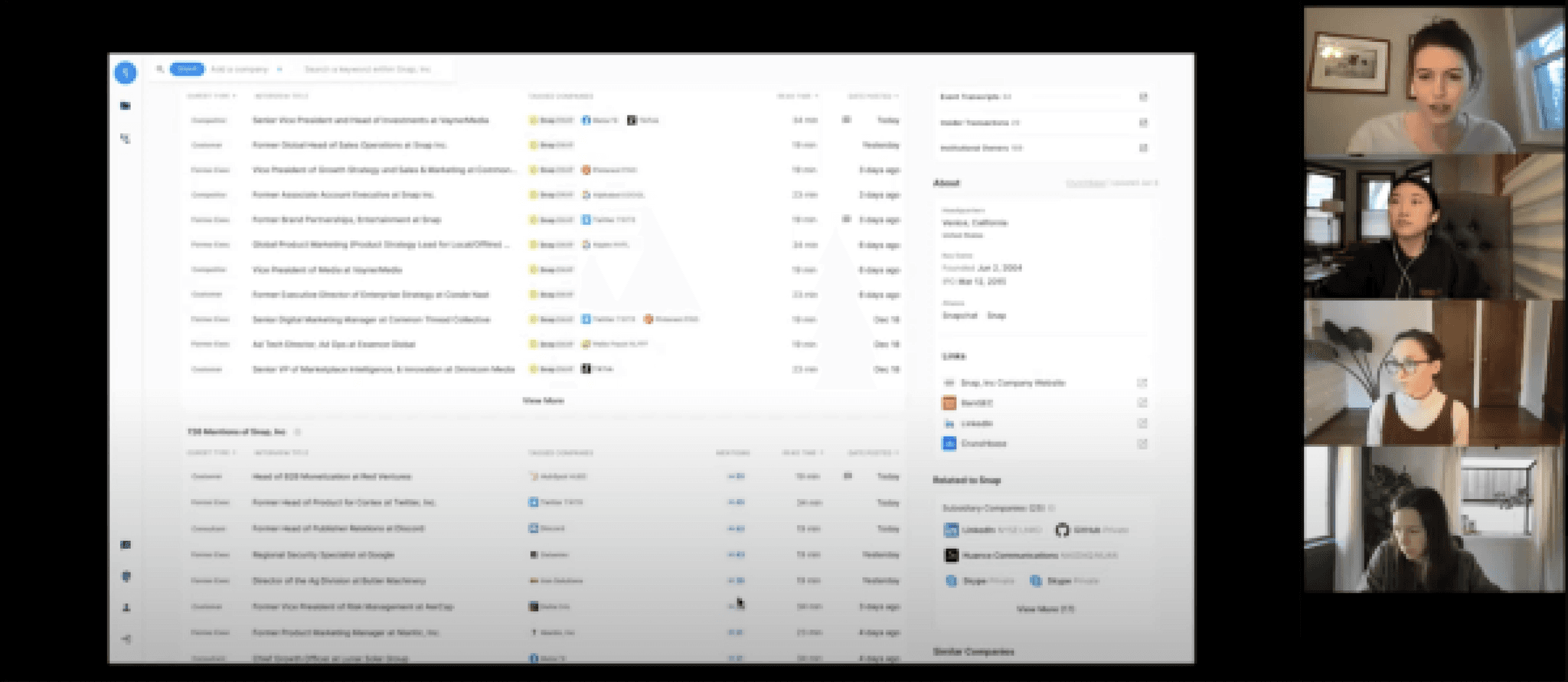
Given the risk, I raised my concerns through a series of design explorations along the spectrum of unfamiliar to familiar to our users – through concise videos sent in Slack (watch one below), I was able to drive consensus that a phased plan was, in fact, needed.
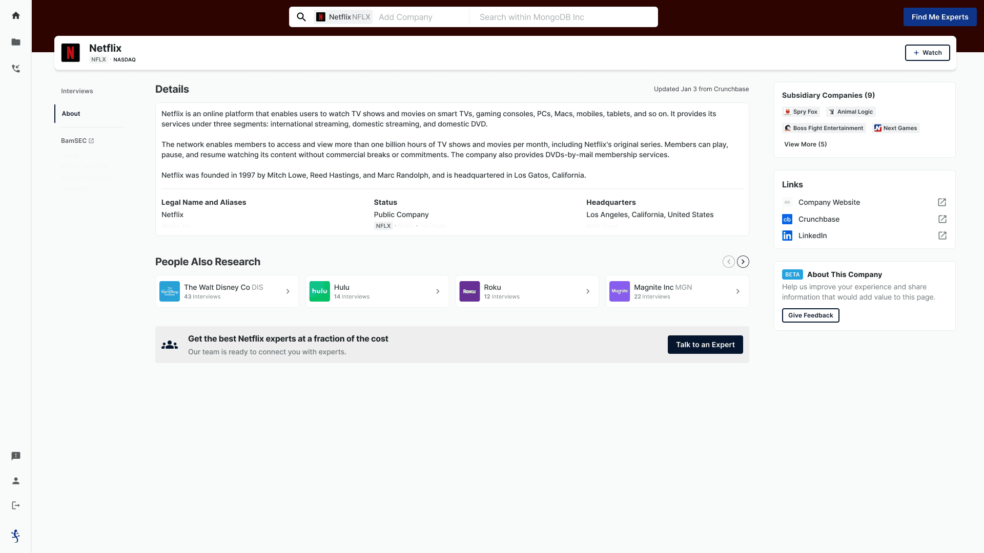
The smaller update – adding a new header to access a simple “about” page – took only 2 weeks from concept to customers' hands, giving us time and capacity to get ahead and learn at the same time.
Phase 2: Establish Long Term Direction and True V1
With an MVP in place, we tackled the real key challenge: two core user journeys - search/filtering and deep reading - were competing in one space, creating friction and confusion.
To improve clarity and user confidence, we split the flow: Search & filters became the Company Profile, while deep reading moved to a dedicated Document View.
Company Profile
As the company page was our most trafficked page, I had helped establish a vision of it as the central hub for all things company-related, not just existing content but also future additions. This meant revamping two key areas:
Information Architecture: The current layout lacked hierarchy, confusing users about their location and navigation. I explored the header, page structure, module prioritization, and page flow to improve clarity.
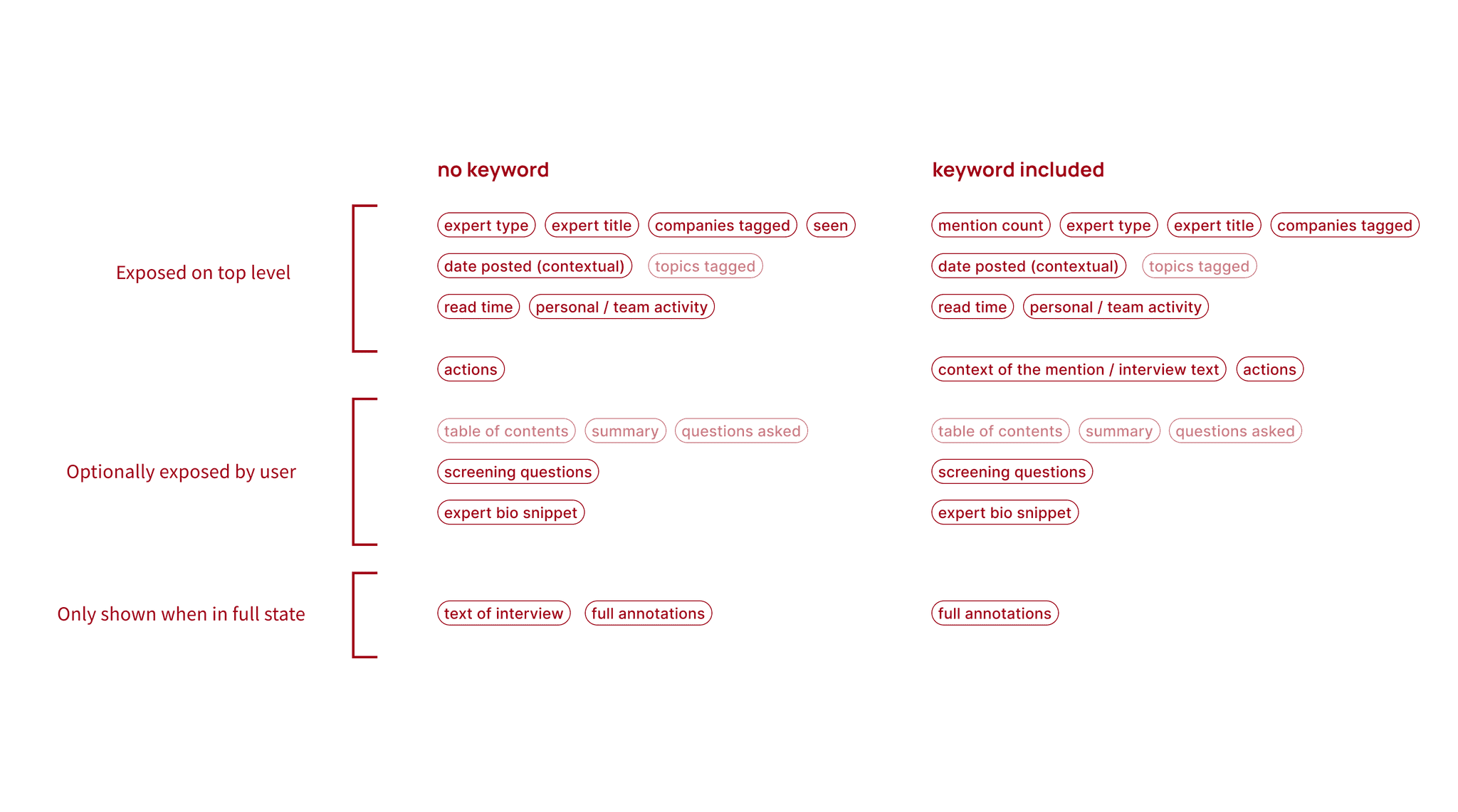
"Atomic Unit": To guide users on what to read, I analyzed the "atomic unit" (individual content cards) and its metadata, considering both present and future content for scalability. With my team and stakeholders, we prioritized the metadata on these cards, making the most crucial information scannable at first glance.
Information Architecture Site Mapping
Metadata Prioritization for Atomic Unit
Document View
Alongside the Company Profile, I tackled the Document View, prioritizing flexibility as a guiding design principle. While some users cherished the clean reading space, others needed fast navigation. My focus areas:
Scannability: Preserving the beloved speed and ease of scanning between results, even in the new dedicated page.
Actionability: Integrating legacy actions like highlighting and keyword search, while paving the way for new features like tables of contents and summaries.
Focus: Enabling distraction-free deep reading for users absorbing critical information for high-stakes decisions.
Drawing inspiration from power tools like Dropbox Paper, Notion, and Coda, I designed flexible layouts with collapsible panes. This catered to customers fluctuating between deeper focus and speed and power.
Testing
All the above was taken to test. Customers first walked through our current experience to set a baseline, then walked through a prototype of the new experience.
Our goal was to see the same or lower time to task to instill confidence a core workflow was still strong.
After 15 tests, we felt confident that the core workflow was enhanced, not disrupted, and walked away with three key takeaways:
Scannability alone is a big value add. The IA of the company profile and atomic unit supported this much better than the old card layout.
We can't assume how a decision will be made. Exposing more metadata was helpful for customers since everyone has their own priorities, even if it looked overwhelming to the internal team.
Unless all information is high value, it's distracting and decreases desire to stay. The priority order of information and what is surfaced on the top level is critical for converting a profile visit to a read.
Final Designs
After another round of iteration, stakeholder feedback sessions or two, these were the final designs that moved into production.
Company Profile
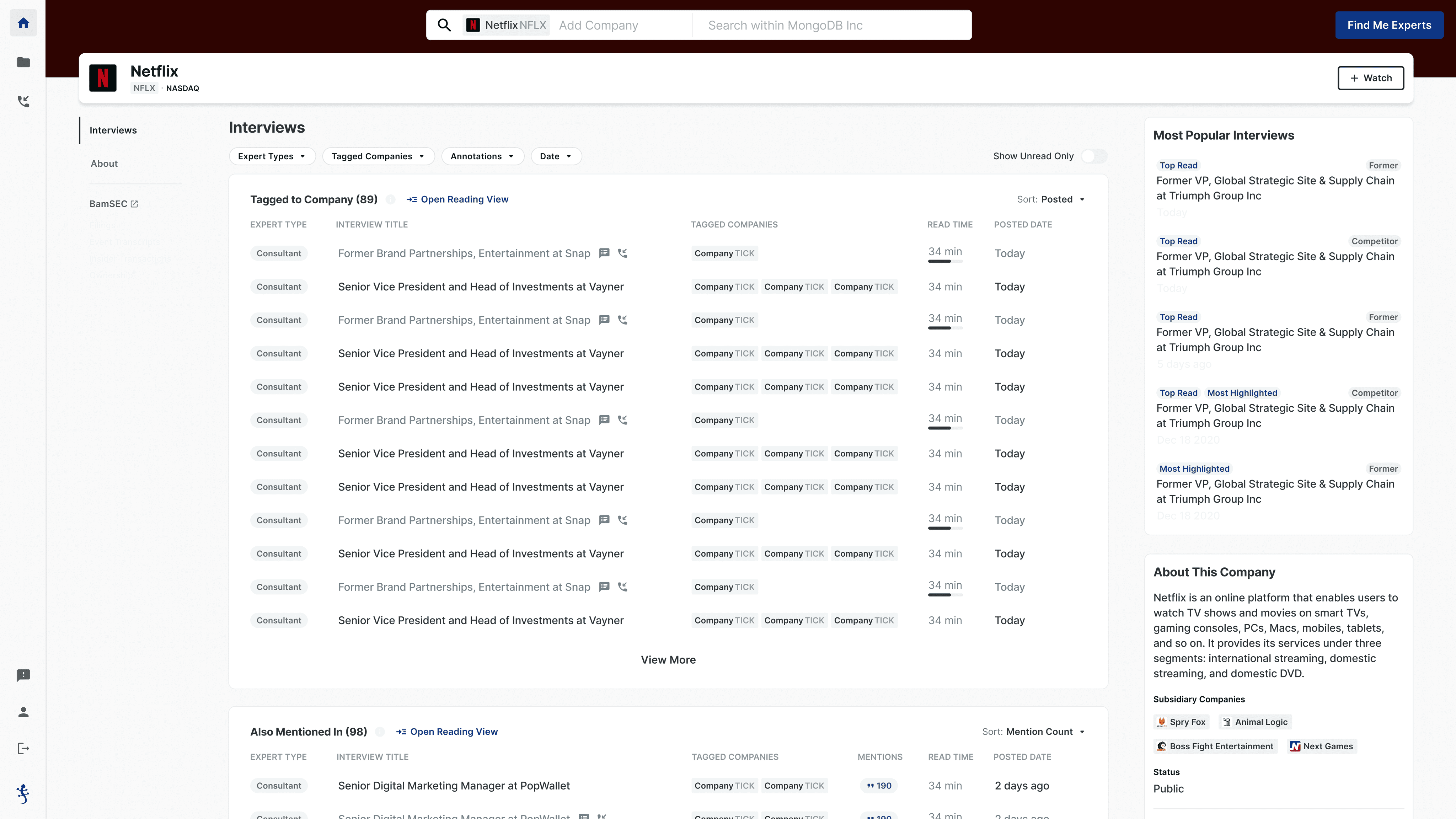
I landed on a data-rich profile page with clear navigation for easy scaling and content addition.
A prominent header grounds the page with key company info, while left-side navigation guides users through available content that makes it easy to scale and add more.
Two scannable modules showcase our atomic unit, and with reading removed, I boosted signals on each for a more confident content selection.
Finally, on the right are modules that supplement and help customers find what's next, like Popular content.
Document View
Given the various needs of this page and the guiding principle of flexibility, I landed on a simple toggle structure with three primary areas.
Results pane, which is responsive to the previous page's filters and sorts to allow customers to narrow down, then take concentrated time on the document view to dive in.
"Jump-to" pane, which allows customers to overlay and navigate various kinds of data, like highlights, keywords, etc, and jump to their places in the document.
The Reading area was given a visual update and a restricted width for better readability.
The focus of each area helps future proof – the results pane can eventually house recommended content, the “jump to” pane can stretch to house a table of contents, and the reading area can contain any kind of document.
Impact
After the initial release, we saw:
7% increase in interview actions
~100 daily views of third-party company information
Positive Company Watch conversion (7:1 Watch to un-Watch)
And now that some time has passed, I can confidently say that this project has had profound impact on Tegus's ability to grow.
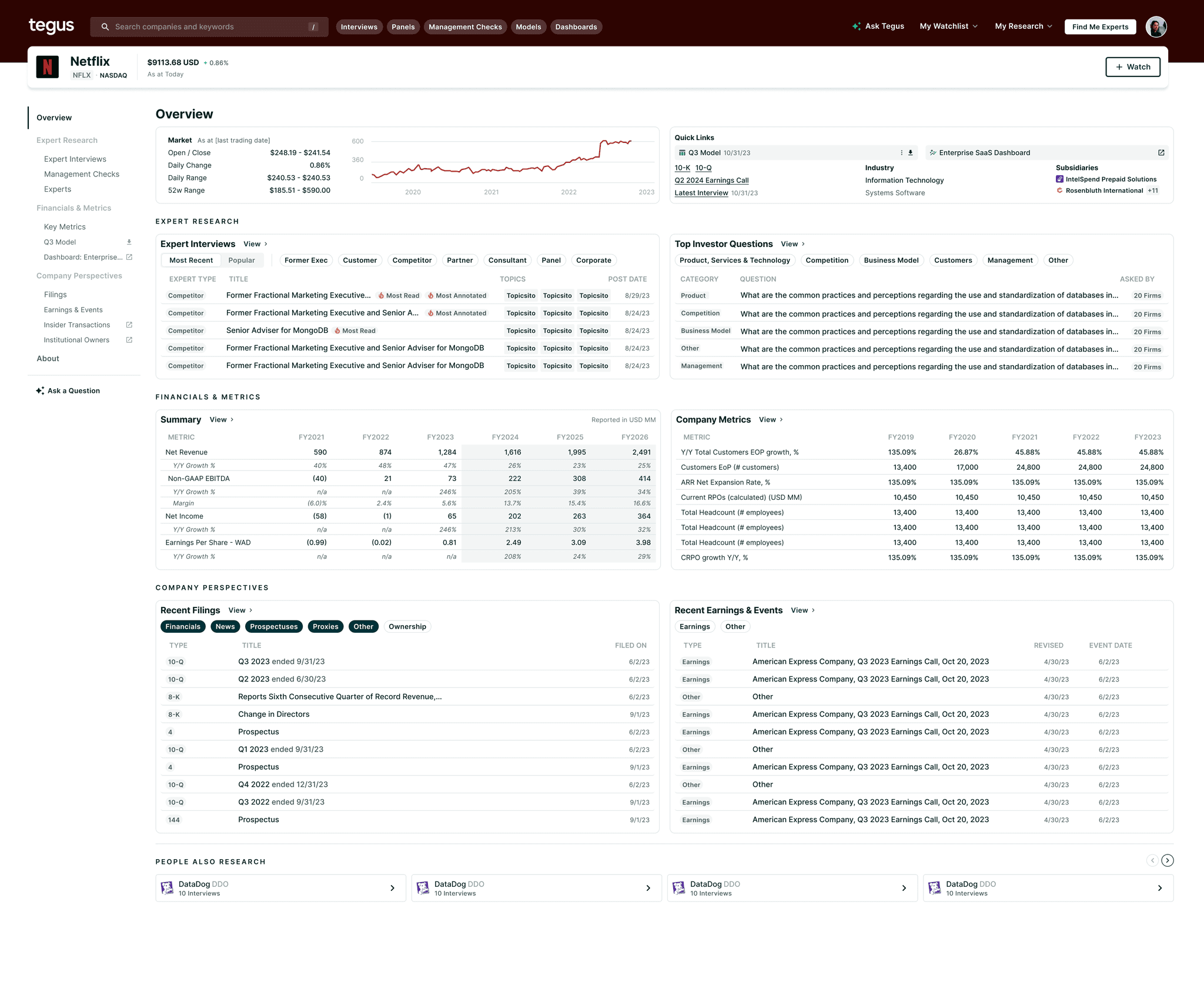
The Company Profile expanded from 3 to 8 tabs while maintaining core architecture, the Document View houses 3 new content types with the same structure, and I most recently added to the Profile with an Overview tab, fulfilling a year-old vision.
As a product, the need for these pages are continually proven, and is a true differentiator between Tegus and some of our competitors.
Reflection
This was a mammoth project, and part of an even larger change (I wrote about this all here). My biggest takeaway:
When you boil the ocean, you miss a lot. We decided to prioritize larger, sweeping changes, and In doing so in such a small period of time with such a small team, details were missed or de-prioritized. Death by 1000 cuts is real, and things like small interactions, visual inconsistencies, etc, have definitely hurt us even though the larger changes were necessary.

